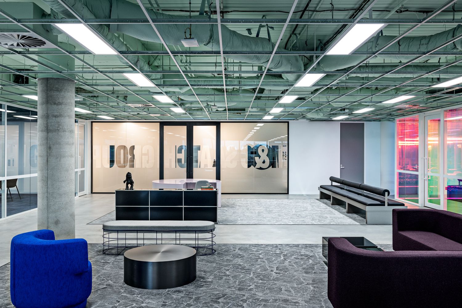
M&C Saatchi.
Made For advertising giants.
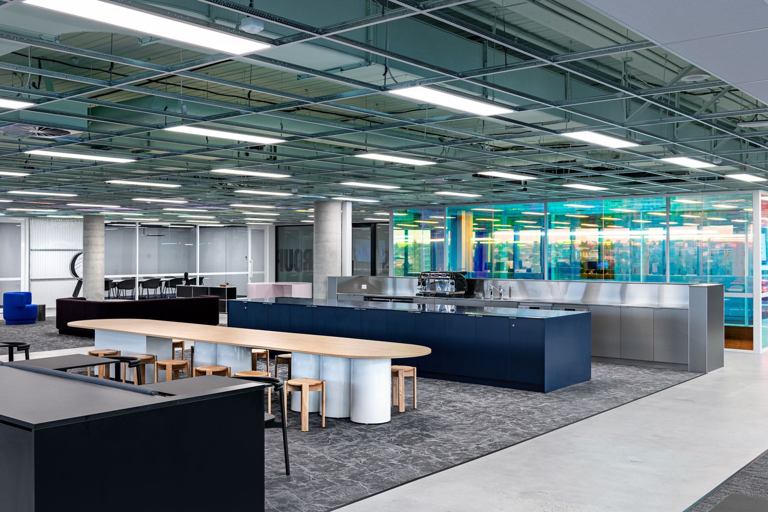
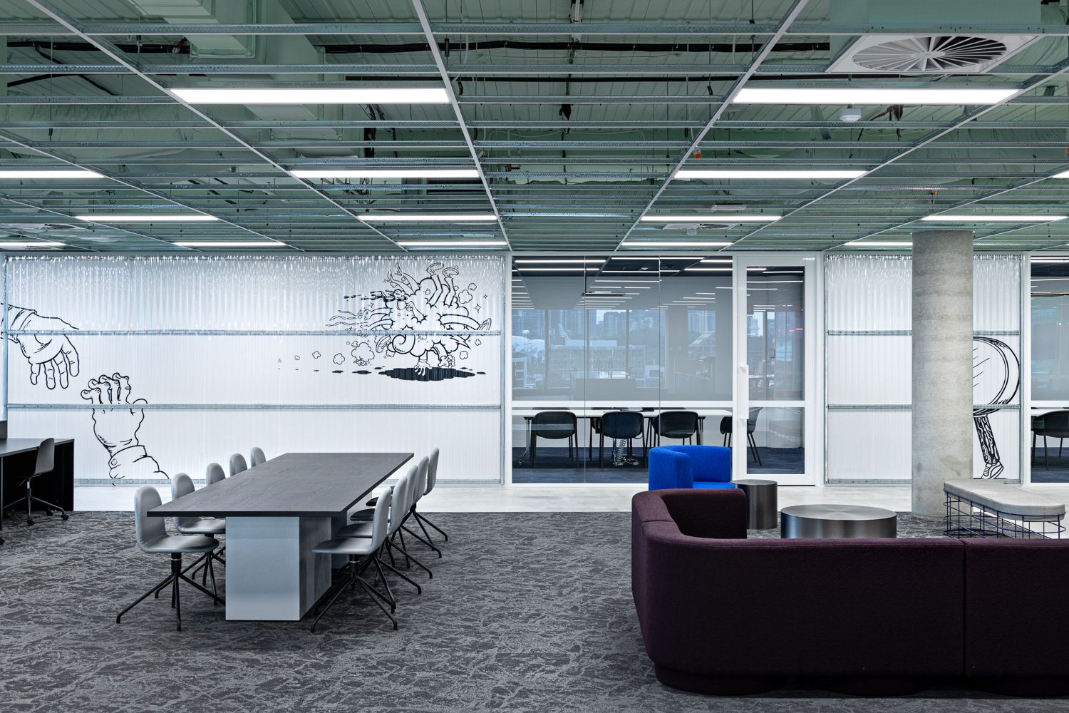
M&C Saatchi was built on early mornings over coffees and late nights over pizza. Connection and culture was built through togetherness. From 2020-2022, they lost some of that spark, not getting to be together every day. Not getting the thrill and energy from sharing a space with the brilliant minds they worked with. “We lost that bump and spark” someone said in a workshop. This is how rebuilt it.
100%
Feel more creative at work
92%
Have a heightened sense of alignment with the business
94%
Feel better connected to their team at work
“Your workspace won’t feel like everyone else’s with Made For. It will feel bespoke to you, your culture and the people that work for you.”
Emma Robbins, Executive Creative Director - M&C Saatchi
“We wanted to nail this combination between really sleek and modern, balanced with pared back, raw elements – we felt like that captured the essence of what the M&C Saatchi Melbourne team were.”
Mitchell Jones, Creative Director – Made For.
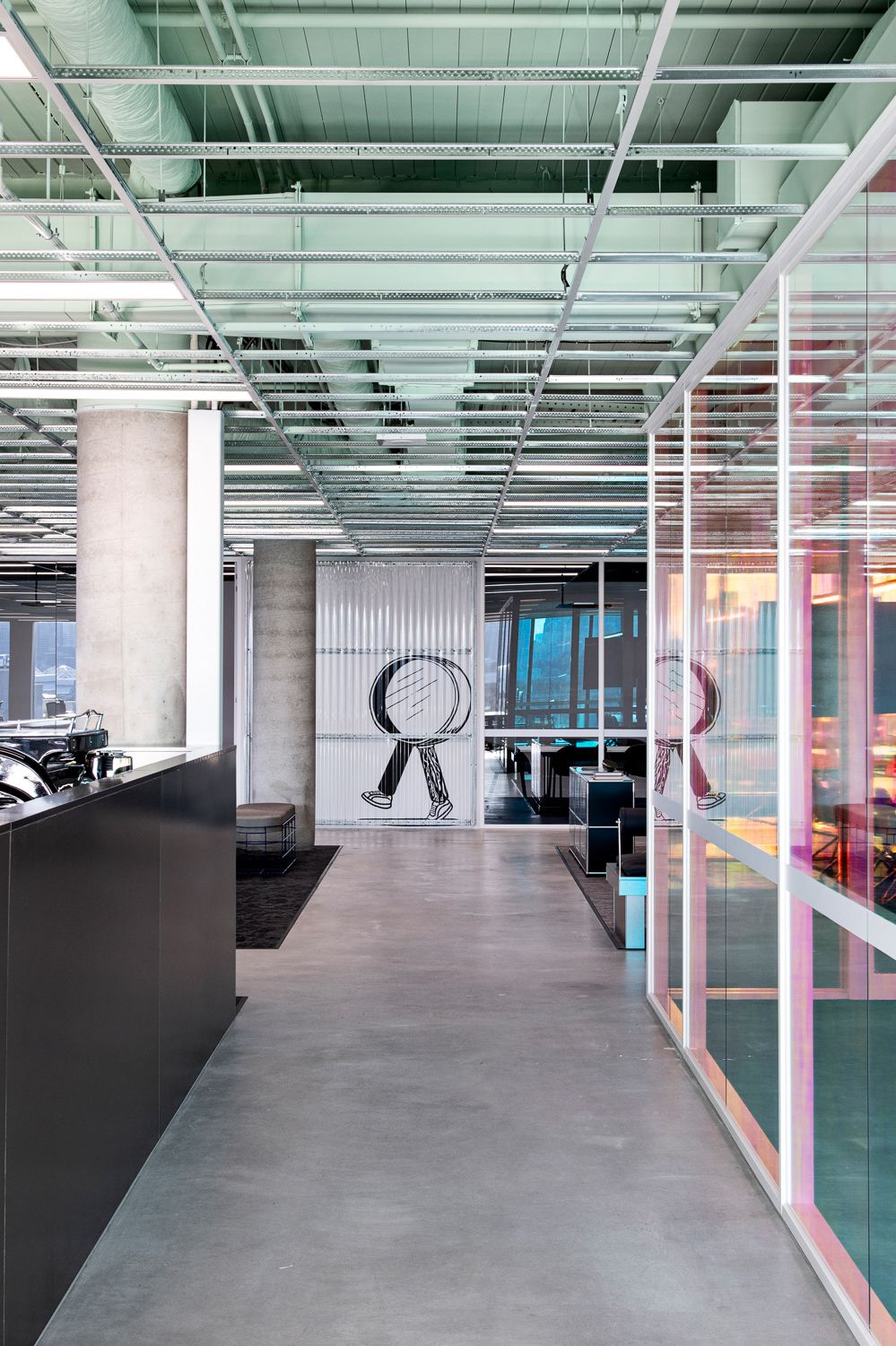
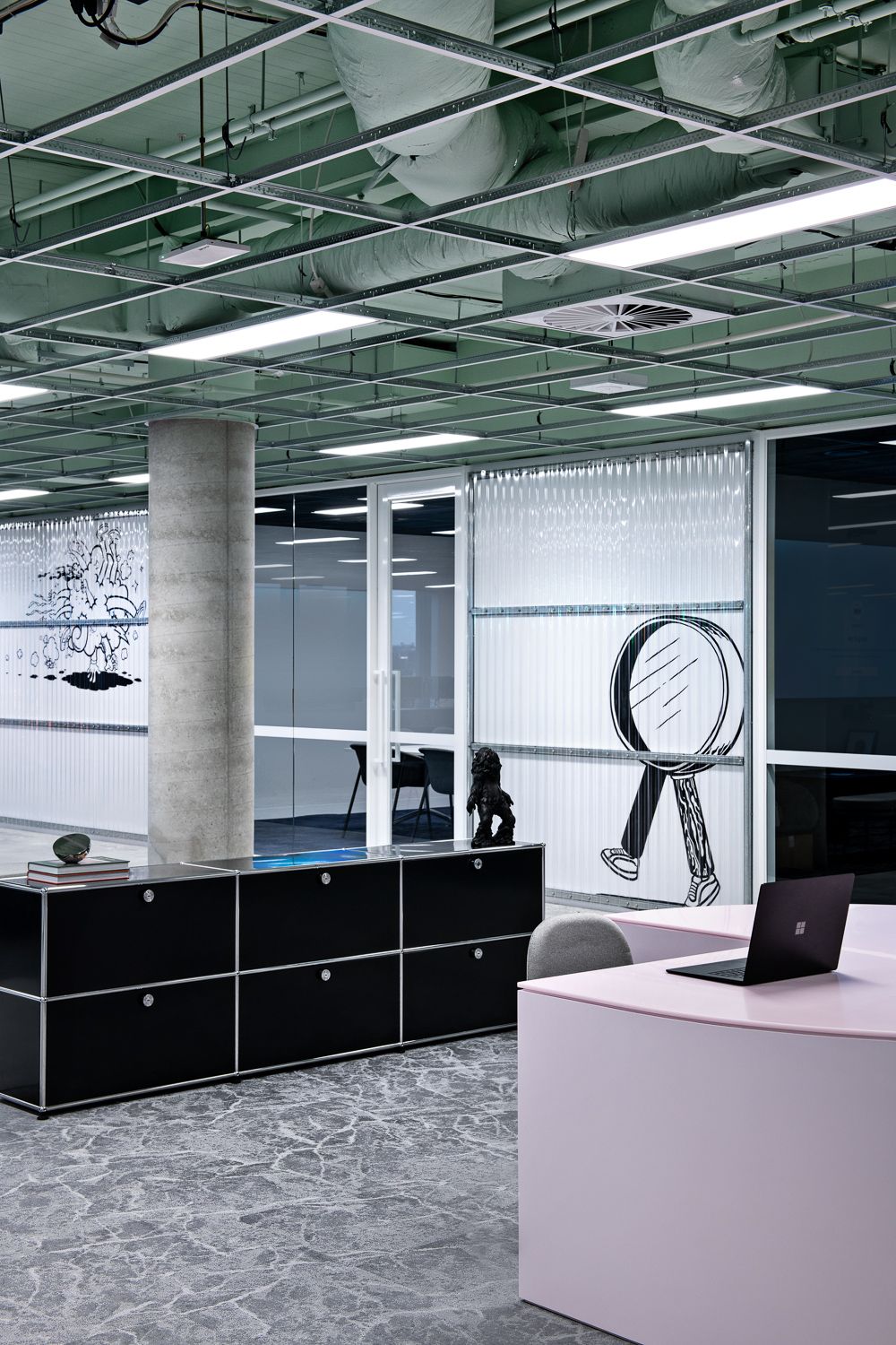
"We designed a space that emodied M&C Saatchi's core values, coupled with a grid-driven layout and minimal built form that promoted organic, serendipitous connections during the workday. We collaborated with mural artist Mitch Walder to integrate playful yet meaningful artwork of the company's brand values."
Cara Stizza, Founder – Made For.